Case Study
Building a Website for the Building Experts
October 31, 2023
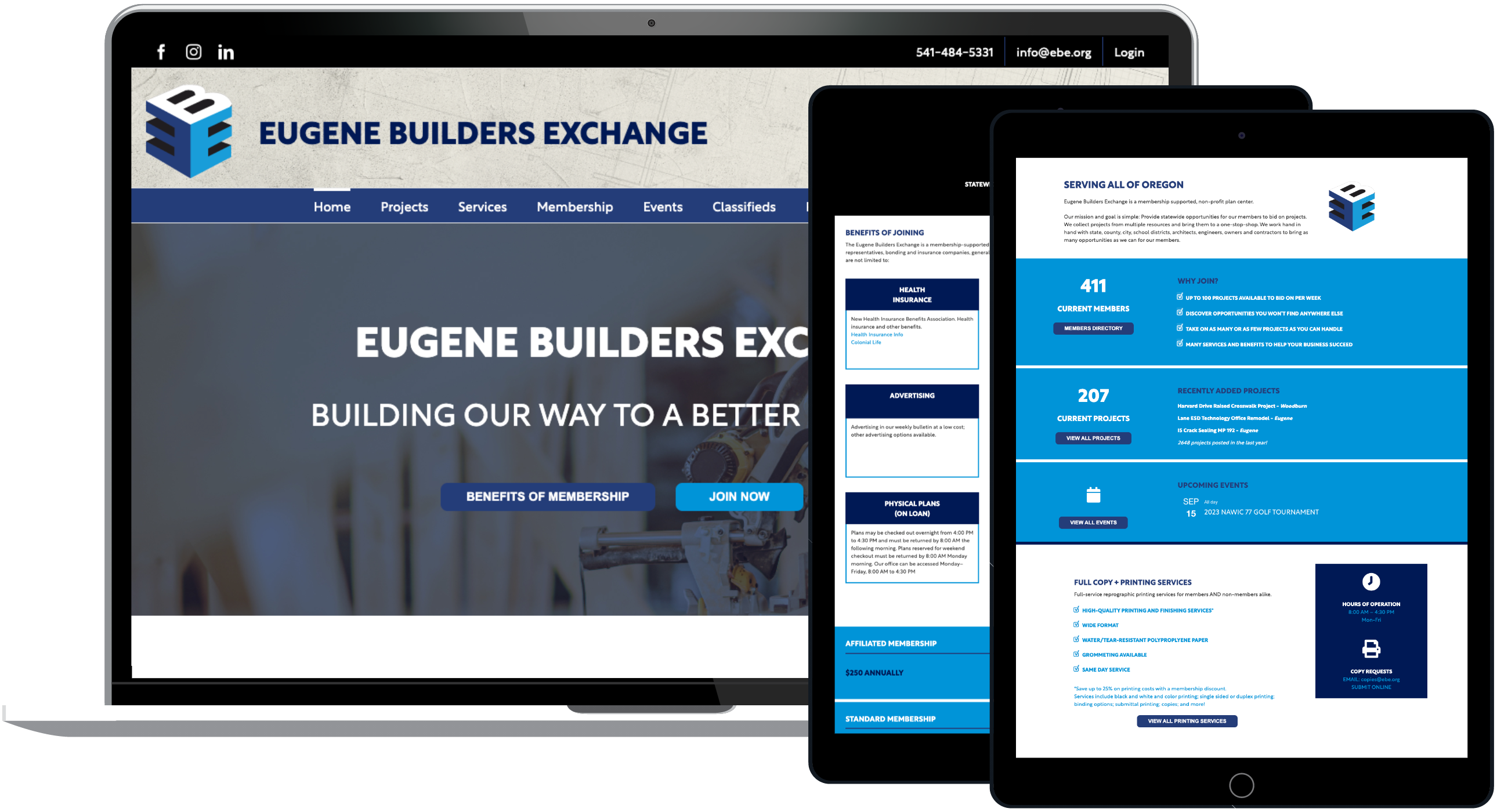
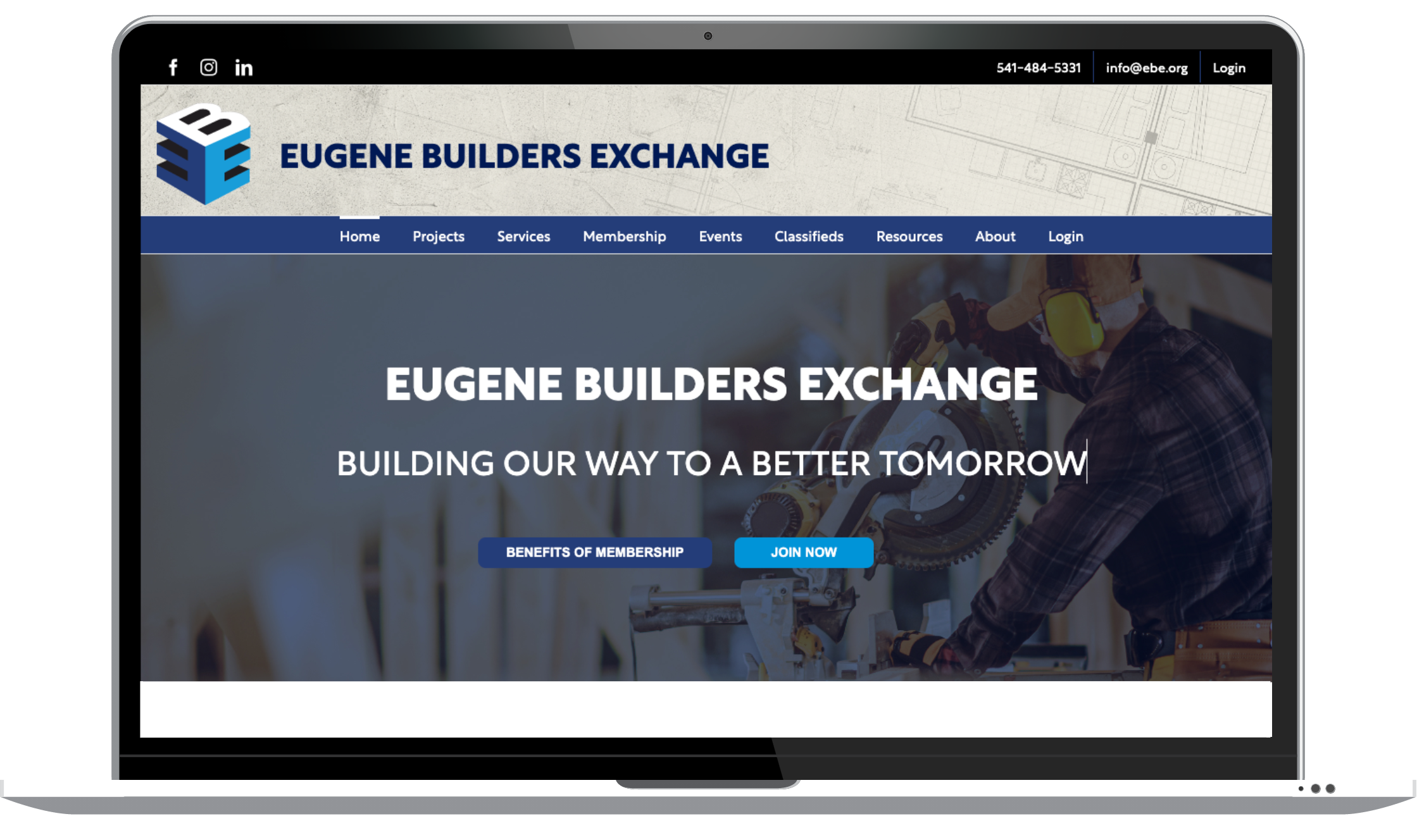
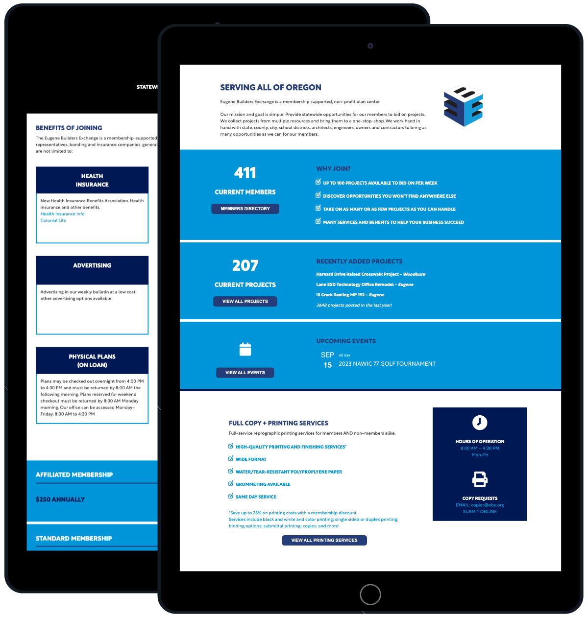
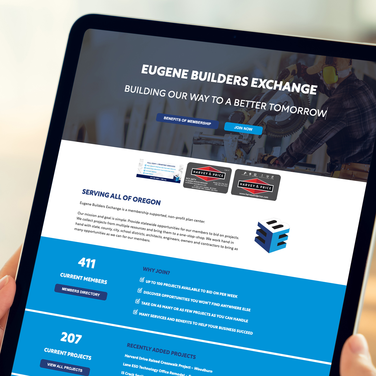
Eugene Builders Exchange is a membership-supported, nonprofit plan center that helps members bid on building projects statewide, throughout Oregon. Their website is crucial to what they do and must be reliable and easy to use.
The Problem
Jeremy Moritz, executive director of EBE, had long wanted to revamp the site and improve functionality to better serve its membership.
“Our website means everything to us,” he says. “Our ultimate goal was to make it the best in the industry.”
When EBE put out a proposal, they initially went with another firm that submitted a low bid. But it wasn’t long before it became clear that the firm they hired wasn’t able to get the job done due to the complexity of the project.
The Solution
Jeremy met with Dana Turell, our president, and Kurt Booker, our web director. Having worked with us previously, Jeremy hoped we could help him turn things around.
“I told them we need to get this fixed, and we need to do it right,” Jeremy says. “Kurt was already familiar with our old site and knew exactly what we wanted. He spent a lot of time learning who we are and what our needs are.”
Kurt has been building websites since the 1990s and was a pioneer in e-commerce. There isn’t much he hasn’t seen when it comes to websites. Given all of that, Kurt still acknowledges that the EBE site was a “massive undertaking.”
“It was one of the hardest professional projects I have done,” he says.
The project involved rebuilding the site from the ground up and was implemented in two phases. Kurt says the biggest challenge was ensuring the database involving hundreds of projects and members, between the old site and the new one, remained in sync even as EBE continued to add project information on a daily basis.
The original website was built in about 2000 by another developer and was coded entirely using PHP and MYSQL database. While it still performed adequately, the code and design was showing its age, and maintaining it while adding new features was challenging.
A decision was made to rebuild the site in WordPress because of its vast network of modern plugins and flexibility to add new functionality.
Under the hood, Kurt built software, crafted code and worked on “bending WordPress to my will,” he says. With some effort, he was able to accomplish the task, with the second phase being completed in 2022.
Results
Jeremy reports that members are very pleased with the improvements. Some are associated with other organizations, as well, and say the difference between EBE’s website and others is clear.
“They have said multiple times our site is the best,” he says.
The number of projects on the EBE website regularly surpasses 200, a rare event before the redesign. And membership has grown by at least 15% to over 400, aided by word of mouth and Google search. Since the redesign, search result daily impressions have grown from fewer than 2,000 and now regularly approach 3,000. Similarly, click-throughs have more than quadrupled, all aided by SEO enhancements to the site.
In addition, more members are upgrading to a higher tier of membership to take advantage of capabilities afforded by full access to newer features.
Jeremy says he continues to have ideas for improvements and is glad Kurt has the drive and expertise to get the job done. He says he would wholeheartedly recommend Turell Group to anyone who’s looking to improve their website.
“Kurt has taken the time to really know our organization and what we need,” he says. “It’s not just a job for him. He is truly interested in what he built. He’s a phenomenal asset to us.”
You might also like…
Subscribe to Talkin’ Turquoise


